Wednesday, March 30, 2011

History of cinematography


Cinematography is an art form unique to motion pictures. Although the exposing of images on light-sensitive elements dates back to the early 19th century, n the infancy of motion pictures, the cinematographer was usually also the director and the person physically handling the camera. As the art form and technology evolved, a separation between director and camera operator emerged. With the advent of artificial lighting and faster (more light sensitive) film stocks, in addition to technological advancements in optics and various techniques such as color film and widescreen, the technical aspects of cinematography necessitated a specialist in that area.Cinematography was key during the silent movie era - no sound apart from background music, no dialogue - the films depended on lighting, acting and set.

In 1919, in Hollywood, the new motion picture capital of the world, one of the first (and still existing) trade societies was formed: the American Society of Cinematographers (ASC), which stood to recognize the cinematographer's contribution to the art and science of motion picture making. Similar trade associations have been established in other countries, too.

The ASC defines cinematography as

a creative and interpretive process that culminates in the authorship of an original work of art rather than the simple recording of a physical event. Cinematography is not a subcategory of photography. Rather, photography is but one craft that the cinematographer uses in addition to other physical, organizational, managerial, interpretive and image-manipulating techniques to effect one coherent process.
After this tutorial, you will be able to turn this:


Into this
:


As Cyn mentioned in her primary colorizing tutorial, the key to a good result is in a good clean source image. The cleaner and better resolution the original source, the easier it will be to work with and the better it will end up. Take particular care to avoid images with large blown out white sections, as these will never look right in the final image. The original I used above was around 2000 x 2000 pixels.

The nice thing about this method is the nature of adjustment layers themselves, you can always go back and change them, messing around with the colors as much as you want until it finally looks right. It also incorporates the layer mask right into the adjustment layer, so you can clean up your selection edges as you go along. It also doesn't require any pre-selection of colors as in Steveo's tutorial, or blending of colors into one another as in Cyn's (though both are excellent methods).
The first thing you should do with any image is clean it up. Dust, scratches, and uneven tones all need to go before you start working on it.

Use the clone brush to get rid of defects, and in some cases the healing brush can be used to add texture to blown out areas. The uneven tones will be taken care of in the levels. It's not required to do any of this, but it will definitely help out your final product. If you're not experienced with levels, this might be slightly confusing, but once you know your way around, this step only takes a couple seconds.

With a colorization, levels are extremely important. Levels can be found under Image -> Adjustments -> Levels. You can also just use auto levels, but that won't always give you the results you desire. By tweaking the levels by hand you can select just how you want your image to end up. You don't have to put the markers exactly where I did, just play around with them until it looks right to you. The middle arrow is the mid tones, which can be adjusted as well.
Now that you have your cleaned up image, it's time to get to work. What you need to do now is select an area to color. Just pick one (hair, skin, background, etc.), it doesn't really matter what order you do it in, you will get to everything eventually. For the purposes of this tutorial, I'll start with the skin.

Using whatever selection tool you desire (I personally just use the polygonal lasso) select all of the skin in the image, making sure you subtract things like the eyes and mouth. If you have a Tablet this step is probably much quicker. Get it close, but don't worry about getting it exactly exact, we will take care of the rough edges in a second.

Your selection will look something like this (over the whole body of course):
Now go into quickmask mode by hitting the circle-in-a-shaded-square icon in your toolbox (or just hit q). This will turn anything that you didn't select pink, and your brush palette will turn to white and black. Now you can edit it just like any regular mask (white brushing reveals, black takes away). The first thing to do is get rid of the rough edges by applying a Gaussian blur to the quickmask (usually around 5 pixels, but play around). You might want to apply some selective gaussian blurring to areas where the skin mixes with another element such as hair, to give it more of a fade instead of a harsh line. Then go around with your brush tool fixing any overlaps (the only thing that should not be pink is the skin).

It should look like this:
Hit q again and it will become a selection again (but smoother and with some feathering). You can choose to just select the entire thing in quickmask mode, but I find it faster to do it this way. It's a good idea to save this selection as a channel, in case you need it for something later. Leave the selection up. Now that you have your skin all selected, and your in CMYK mode (you are in CMYK mode right?), it's time to color.
Make sure your original layer is selected (it should be the only layer right now) and your skin selection (from page 3) is still up, and go up to Layer -> New Adjustment Layer -> Curves Name the Adjustment Layer "Skin" and click "group with previous" This will bring up the curves dialog box, and it will add a layer to your layers palette.
This is where all the magic happens. As I mentioned before, since this is an adjustment layer, you can always go back and edit it by simply double clicking on the curves icon in your layer palette. The black and white image to the left of the curves icon is your mask layer, which can also be edited (if you need to reveal more or less skin for some reason).

By adjusting each color curve individually, you will add color to your selected area. Now you can memorize exactly which values of curves give you what color, or you can just play around and eyeball it (what I do). Raising the curve up and to the left gives you more of a color, and down and to the right less. You can also add points to the curves, and tweak the highlight and darks to be different hues, but for now I'll just keep it simple, with one point curves.You can also adjust the Black levels the same way if you want your shadows to be darker, and the combined CMYK curve will adjust the brightness and darkness of the entire range. Next step is hair. New Adjustment layer, etc. It looked like brown hair would work the best based on the original, so I went with that. Raised magenta and yellow up, some small tweaks to cyan and CMYK, raised the black a little. I have no formula for colors, just keep messing around until it looks good. And remember you can always go back and edit it later.

A key point with hair: When you have whispy hair that partially covers skin or background or whatever, you will want to go to your mask layers and use a the brush tool to work with the layers until you have no overlap. You can also selectively blur, smudge, and use greytones in the mask. You want to avoid color overlap, because it creates an obvious line of color across a section of your image and makes it look bad.

A note about eyebrows: If they have black eyebrows, you can just color skin tone right over it, otherwise, color it the same as the hair and make sure you have no skin tone/hair color overlap.
For this image, I added two new (regular) layers and put them on top of the original. One I set to overlay mode, and painted in some pink/red highlights on the cheeks, bridge of the nose, chin, and forehead, then lowered the opacity until it looked good. I also added a small white gloss layer to the lips.The original on the bottom, your two tweak layers, and one adjustment layer for every item you colorized.

Your image is now fully colorized. If any colors look off, simply go back into the curves and change them. I would suggest leaving it for a couple hours, and then coming back to it for some more editing. It's amazing how your perception can change once you haven't been staring at it for a while. It's also good to get some outside opinions.

Done at last...
Your final work should look something like this:

This may seem complicated, but it's really not. All it boils down to is selecting a part of the image, moving some curves around until you get a color you like, and repeating. It's all about trial and error, everything in your .psd can be edited if you don't like how it turned out, tweak a color here, add some yellow there, it all just boils down to your eye for color.

It's actually quite simple stuff. This was my second colorization ever

Sunday, March 27, 2011

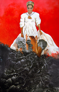
Romanticism Collage


Our most recent project that was assigned in CyberArts was a choice of a dry point print, or an artistic collage, both in which had to be representative of the romanticism style.
I chose to do a collage, which I feel came out looking great. My collage is based of the prominent mythical figure, Aphrodite, and the resultant effects of her world renown beauty. What I was trying to portray with this piece is the effects that beauty has on mankind, and to show specifically that beauty, however ravishing and breath taking, comes with a grotesque dark side. Which stems directly from male instinct and the abundant need for dominance amongst men. Essentially, this piece is trying to convey blatantly the lengths men are willing to go to in order to attain such beauty.
By focusing on this myth I believe that this piece greatly portrays the romanticism style, due to it's emphasis on drama, contrast, myth, emotion and a clear focal point. All of which are the main characteristics of the romanticism style.
I decided to make Aphrodite in color, while the battle below her was in black and white in order to create contrast between the subject matter. I then placed both on a gradient background, from red to black, which I feel no only strengthens the piece's contrast, but gives the impression of blood, adding to the drama of the piece. I also created drapes, in which Aphrodite clenched to, and near the bottom, the drapes were soaked in blood adding to the drama and intensity of the piece. By drenching her garments and drapes in the blood of the men willing to die for her beauty, I feel, successfully creates drama and emotion to the piece, ensuring that the romanticism style, stays consistent throughout.
The main characteristic of romanticism is a clear focal point, which I did by emphasizing on the transition between the goddess and the battle amongst men, using various cut outs of arms and faces, drawing the eyes focus to that central point. For this focal point I decided to combine both colored and black and white imagery to portray the transition between natural human behavior, and the nothingness that becomes of men once instinct and drive replace judgement and rational thinking. By showing this contrast in color as well as the variant facial expressions, expressing agony and lust, in the same area, I feel as though it perfectly portrays the true nature of man after being influenced by beauty. Creating an interesting and favorable focal point, which draws the eye and essentially serving as the main purpose of the piece.
In addition to my focal point, one of the reasons my piece turned out looking great, was due to the composition. I decided to do a triangle composition, starting with the crown of Aphrodite, and the elongated flowing nature of the unfolding battle. I felt as thought choosing a triangle composition was beneficial because it created movement throughout the piece, with an emphasis on the focal point. By doing a triangle composition, I feel as though it unified the piece, providing it with a finished feel. This positively added to the quality of the piece.
During the creative process however, it took a lot of effort to finally get to the finished product. I initially had difficulties deciding the positioning of each cut out as well as balancing the piece by having an even ratio of collage to paint, due to the majority of the background being a painted gradient. I also had difficulty creating a purposeful composition, while unifying all pieces of imagery. In the end however, I feel as though I successfully portrayed the message I was trying to express, while still having it be purposeful and unified.
If I could, I would change the positioning off the men battling on the left side of the collage because it covers most of the drape, which I wanted to clearly show as well as making the piece unbalanced, and although the a symetrical nature of the piece looks interesting, it wasn't purposeful. Which is the only aspect I would change about this piece. Overall, I am very pleased with the way it turned out mainly because I impressed myself. All I can hope for is that you enjoy it as much as I do.

Sunday, March 6, 2011

Friday, March 4, 2011

Chalk Cropping Work

This copping (left) was the starting point for the following pieces which I created in CyberArts. With this cropping I recreated the image three times, two were paintings one large scale and one small scale as well as a true recreation done in pastel (the same medium as the cropping) but on a large scale. I chose this cropping because it had an interesting composition (DIAGONAL).

The first piece that I did was the large scale chalk pastel done on a form of newsprint. For this piece I decided to add more value in it then the original cropping. By doing this I feel as though I successfully made the piece more interesting by bringing in multiple lowlights and highlights, which not only added value, but I feel it also added mood, because the different tonal values, I feel help portray the facial expression of the subject matter I was recreating. Changing the size of the piece however, I feel these changes benefited the composition by emphasizing the diagonal composition, making it stronger.

The second re-creation of the cropping was a large scale painting. This was my favorite one because I enjoyed the large area to work with as well as the medium. I was particularly fond of this one because I feel as though I have advanced in brush stroke technique. My lines look purposeful and meaning full and the rough nature of the brush strokes, I feel best portray the expressionistic feel I was trying to show. For this re-creation I was trying to use lose and fast brush strokes to give the piece an expressionistic feel to it. For this piece I also added a large range of highlights and lowlights but I used expressive brush strokes while creating these highlights and lowlights to continue the expressionistic feel. By changing the way I added the highlights and lowlights I feel as though it changed the mood of the facial expression to that of a more concerned one. Also another of the significant changes that I made from the chalk recreation to the painting was a gap in color in the eye. I made the eye in the painting look like a more realistic eye, which I feel added to the change in facial expression of the subject matter. Lastly in the large painting I added small flicks of red pain near the mouth area, to finish off the painting by adding ( which I fee made it stronger) to the expressionistic feel of the painting. However changing in canvas size and medium made it difficult to emphasize the diagonal composition. I feel as though the added value, although adds interest, pulls the eyes attention away from the composition.

My last recreation of my initial cropping was a small paint were like the big painting, was done in acrylic paint. However I found the change in canvas size to negatively impact the end result, because I am not fond of such a small work space. I for one and more fond with a larger canvas, more room for expression as I see it.
There were several things in this painting that I changed from the large scale painting. Firstly I changed my line thickness so that all line were thin, clean and purposeful. I also tried to add more energy into this version, so I purposeful roughed up my lines (unclean) to add in that feeling of expressionism, while still being realistic. Secondly I played with the actual form of the lines to try and change the feel of my subject's facial expression, especially near the mouth ( I tried to make a smirk). Lastly, although it is almost non existent in the photograph, I added in a really light yellow in the whites of the eyes to simply change up the face so that it more closely resembles the original cropping. I feel as though the changes I made from the larger painting to this one emphasized the composition more.

These are the three pieces which I created from my small little cropping, and I am extremely happy with all three pieces. The fact that all of these were done within the first two weeks of the course, I am extremely happy with not only the quality of all three pieces but the simple fact that I created all of these within such a short time frame, I feel, portrays my level of improvement from last year.


Thursday, March 3, 2011

Good Vs. Bad Music Videos

Lil John's- Snap Yo Fingas

This first video is an example of a poorly made or bad music video. It is bad for several reasons. Firstly the video has too many things going on, although simplistic in nature the excessive flashing lights make the video almost to intense to enjoy. While watching this video it is enjoyable mainly because it irritates the eye. Secondly, the flashing lights, I feel, distract the viewer from whats actually going on in the video. The lights almost completely distract from the subject matter, which I feel is a negative aspect in a video, especially when the subject matter is the main point of the video. However that being said , the subject matter of this video adds to its negative level. For almost the entire video the camera is focused mainly on " LiL Johns face, which is not only unappealing but boring. Lastly, I believe that this video wasn't made with the consideration of an extremely dangerous condition called epilepsy, the extreme flashing lights could cause someone viewing the channel the video was played to go into immediate shock. This disregard for the health of the viewers adds to the negativity of this video. It is these reason why this is a perfect example of a bad music video.


Highway Of Heros- Trews

No like the previous video, I will not comment on the actual song featured in the music video but rather the video itself. This video unlike the other however is an example of a good video. It has an extremely influential and meaningful message which, through editing, is beautifully portrayed. As well I feel as though this video has a clearly developed mood, which helped me appreciate this video. The last thing that makes this video a good one is the fact that it uses large amounts of imagery to portray its meaning, and when a powerful method like imagery is implemented the true message of the video is clear visible. Which is why I consider this a good music video.

Wednesday, February 23, 2011

Bambi Remake Trailer Reflection

The piece above (coming soon) is a modified Bambi trailer which I edited with the program imovie. The objective of transforming this trailer was to recreate the mood and the overall feel of the trailer by manipulating and changing the its initial sound. I decided to change Bambi, a sweet hearty tale about perseverance and love, into an extremely intense adrenaline pumping action thriller, filled with excitement of epic proportions.
The first thing I did was extract the audio, in order to have complete control over all the sound, which I needed in order to ensure only purposeful sounds were in the final piece. After extracting the sound, I then proceeded into editing the trailer into various segments, removing any scene that didn't support the new theme of intensity. Once all the video suited what I had in mind for the transformation, I then added the main music that would be playing throughout the entire trailer. Seeing how I was trying to change this trailer into an intense epic one, I decided to use the song "Intense Music" which I downloaded from Youtube.com. After adjusting the sound in garageband I then exported the mp3 into imovie. After having my initial background music, I went to work on putting in various sound effects and noises to add a sense of intensity and seriousness. There are certain points in the trailer were I've put in certain sounds that would normally sound right in that situation but given the background music it was purposeful and effective. One of the main places I did this, is the scene where Bambi and Baline are walking toward each other, when an opposing male enters, challenging Bambi. It was at the point that the challenging deer entered that i introduced a thunder clapping sound, to add intensity and to set mood. When both dears later got into a head butting battle with their antlers, for each impact I added a thunder clapping sound, to strengthen the mood that was set as well as to dramatize the situation. I also added various background sounds ie: dogs barking, fire crackling, explosions, water splashing ect... to not only intensify the scene but to add a feeling of concern due to the multiple destructive things that were occurring. This i feel truly made my trailer a finished piece.
However, other then sound manipulation, to make this trailer look finished and consistent with the mood I was trying to convey, I added various video effects and transitions, to strengthen the mood. For example, there is a section where the screen turns black and white and their is a still frame of the three main characters faces. I did this because this is when the background music became more intense and that effect with the combination of the music, I feel, supported the mood I was trying to display effectively. I also added various "fade ins" and "outs" in certain places to help keep the mood and emotion constant.
If i was able to start the project over, I would have worked harder to find a better video quality trailer because working with an average or low even video quality trailer was difficult, only because certain effects needed to be adjusted in order for it to still look professional. While I was creating the trailer however I came across many challenges. I was unable find the right sound effects that would add purpose and meaning for an extend period of time, and I had to experiment with a lot of different sounds in order to find the best one to use. I also found it challenging to keep the music in sync with certain times of the trailer while still trying to edit, only because once a clip of the trailer is edited the time frame shifts ever so slightly which could have drastically effected the mood, if the timing wasn't complementary to the music. Overall I enjoyed this project and I consider it a success, hope you enjoy.

Monday, February 21, 2011

Audio Recording Engineer


An audio recoding engineer is just one of the many jobs in the cyber arts world. They are the ones behind the scenes making sure that everything runs smoothly and on time (sound wise). Being an audio engineer however means that you are responsible to complete many jobs, to ensure the best sound quality. They set up and test recording equipment, operate recording equipment to capture performances, combine separate instrumental and vocal tracks to create final products, suggest ways to improve sound and they solve technical problems when they arise. All of these jobs make up the job title " Audio Recording Engineer", which is why its such a challenging job. But the beneficial side to being and Audio Recording Engineer is the pay. To the the demanding ours and intense situations that Audio Recording Engineers endure their starting yearly pay can be between 20-80 thousand dollars, however the pay rate increases with experience.
Due to the large demand of audio recording engineers in various fields, such as , radio, recording studios, film and post production companies, audio recording engineers always have opportunities and places to work. Which is beneficial in todays economy, but that isn't the only benefit to being an audio recording engineer. The workplace for an audio recording engineer is usually indoors in soundproofed rooms, though some may occasionally do recordings of live events at outdoor venues.Hours are irregular, and evening and weekend work is common and due to the intensity of the job 20 hour days can sometimes be common. But one of the best things about becoming an engineer, for most people at least, is the fact that no special education is required. All that is needed is a high school education. Anyone, with a little effort, can be an audio recording engineer. All you really need is a "good" ear, a technical understanding of music, creativity, an attention to detail and basic computer skills.
Hopefully this little passage will inspire you to dive into the career of audio recording engineering. so good luck, and have fun.

Sunday, February 13, 2011

Top Three Tips To Becoming A Master Jedi.


Tip One- Meditation
The first and one of the most important keys to becoming a master Jedi is the daily practice of meditation. In order for one to truly become one with the force, extensive meditation is required. Meditating stimulates midichlorian activity (microscopic beings that are responsible for the force).
For a master Jedi is strong with the force, so naturally daily meditation shou
ld become a regular practice. Merely spend 1-2 hours a day, in a secluded area, breathing. Try to clear your mind of all thoughts, to allow room for midichlorian influence. When done repeatedly meditation can be used to strengthen one's relationship with the force and with one's self. It is only through meditation that true Jedi mastery can bee achieved.

Tip Two- Force Exercises The second thing you must do in order to become a master Jedi is constant practice of midichlorian manipulation. In order for one to become better using his or her force abilities, the daily practice of force movements and exercises is mandatory. A beginners exercise that is easy to master, yet takes discipline to achieve is force levitation. Order to preform force levitation, one most first clear their mind of all thoughts, let the body become an empty container wanting to be filled. Then one must concentrate solely on the object of interest (try smaller objects like fruits or cutlery at first) and let that object becoming the only thing being concentrated on. Lastly you must visualize the midichlorian inhabiting your body and then leaving (usually out the tips of fingers) and surrounding that object. Before you know it you'll be levitating all sorts of things in no time. But remember, it requires practice, so if not achieved on the first try keep trying for developing force abilities takes perseverance.
Tip Three- Light saber Training
Lastly, for one to become a full Jedi master, one must be able to wield a light saber effectively and with confidence. Now in order to be able to master wielding such a powerful weapon, one must consider the blade an extension of the body rather then a tool of destruction. You must become one with the light saber, this can be achieved easier, if you were to make your own blade. (Saber crystals are found in the ice caves off the moons of Endor). In order to develop a technique however, one must find a Jedi master to serve as a teacher, for technique development is almost impossible without guidance. An easy solution however, if you find yourself without a master is to study the Jedi holocrons, located in the restricted section of the Jedi temple's library. These holocrons can be used as tools to better ones light saber capabilities, for they contain past knowledge from former Jedi.

Hope these tip serve as a gate way for you to truly become a Jedi master. But remember the path to the dark side is one easily followed, but the path to becoming a Jedi master is rewarding. I leave with these final words of wisdom. Fear is the path to the dark side, fear leads to anger, anger leads to hate, and hate...leads to suffering. BE WISE FUTURE JEDI, BE WISE.


Friday, February 4, 2011

Into The Life Of The Great One

Hi, My Birth name is Jaylen but the name given to me by the universe is kuchaguliwa moja which derives from the swahili phrase, the chosen one. I am intrested in nothing this world has to offer me for i have detached myself from the the meaningless beings on this earth in order to reach spiritual enlightenment. I enjoy only the the pieces written by john william. I eat a lot of food for my stomach is capable if endless expansion. I have a job and I have countless resources of midiclorians at my disposal. So be warned. Im good in school and am considered in academic according to my reputation. If you require or lust for any more information about myself please mail me a request. Lastly on a side note i took cyber arts to better my chances for university, i enjoy photography and have developed quite a skill in it. Also in my spare time i enjoy influencing midiclorians, along with the chi in my body to gain control over my surroundings.