Friday, October 31, 2008

MOOD


Mood, this image in my eyes best represents mood for this reason. The image itself isn't mysterious at all but the way it turned out is. This image to most people looks like a myestrious stranger walking down a lone hallway, creeping about. What this picture actually is a light bulb but the camera was shaking to create this blured affect. Creating a hole diffrent picture sceme within the picture. By doing this it creates a diffrent mood then the picture would normaly be and it adds meaning. This image has other aspects of photo composition such as linear, lines and center of intrest.

SIMPLICITY


I think that this photo best represents simplicity because I took this picture on the bases of what I wanted the viewer to see. I focused on the car wheel and not the hole car because that it was I wanted the viewer to look at and nothing else. The car wheel isn't the most exciting piece but I enhanced to add depth to the image. Overall this image is very simple and elegant.

Wednesday, October 15, 2008

photography lines


There are three types of lines, horizontal, vertical and diagonal, each one has a different impact among your picture. Lines are a very powerful element in the photography world, it takes a lot of practice to get the precise pattern of lines. So when an image is based on the concept of lines it is focusing on the lines within the picture, eg vertical horizontal and diagonal.

simplicity


Simplicity is what you want the viewer to see { focus on } in the image. Easy and simple. To make an image simple there must not be a cluttered background, because a busy background would draw the attention away from the image.

Tuesday, October 14, 2008

LOGO ASSIGNMENT


My company is called NRGY DESIGNS, I choose this name because the animal that I picked for my logo is a monkey which is naturally energetic, out there and loud. Which I think not only represents me but my company as well. My company specializes in a variety of things. We can be asked to create a design for the sticker on an ipod or a major design to represent another company on a billboard. My company also deals with personal contracts, we can create logos for other companies or a cereal box design for a small corporate business.
For my colored version of my logo design I used energetic lines to create an exciting feel to it. I used contrasting colors to show that my company is unique. In my eyes I believe that my logo is great.

Friday, October 10, 2008

BLM Designs


BLM Designs is a design company that specializes in eight aspects of graphic design. The BLM Design website is a data base for graphic designers, it is an inspirational site and usually helps people with graphic designs. The eight main aspects in which they specialized in are web design, data base design, graphic design, flash design 2d animation, 3d modeling, av production and curriculum vitae. The point of this website is to find what you need help with and do it. This site also has many graphic designs created by student. If you want to check it out yourself at www.blmdesigns.com

Thursday, October 9, 2008

Wednesday, October 1, 2008


Chess Piece

For this assignment the objective was to draw a chess piece and create your own background with movement. My chess piece was a king and I mad sure that before I started on my background I made sure that the chess piece was in proportion and lined up. What I did was add value by not only shadowing the chess but also the background. I did this by shading in the lines to the background so that there was no definite line. The theme of my picture was an underwater type background, I created movement with this by varying the thickness of the lines. When I was finished my drawing I had to add touch ups to make that the lines were crisp, and that the shadowing came right up to the line. By doing this you create the illusion of movement and also gave me a professional image. I believe that I meet the requirements that influenced a key part to create this assignment.

Tuesday, September 23, 2008

CyberARTS
Rhythmic and Repetitive Assignment


I feel that rhythm is a key factor in art. Without rhythm a picture has no motion. In my first comp which was repetitive lines I tried to create the illusion that you were in a forest with a blanket of snow on the ground. I did this by changing the thickness of the lines and by placing the lines closer or farther apart. I think that by using this method the picture controls the audience by telling the eyes were to go. This picture makes your eyes follow each line regardless if it looks further or closer away.
In my second comp which uses rhythmic lines I tried make the lines geometric by placing the lines in a box and making almost a ripple affect but in a square shape, like vents on a selling. By varying the amount of lines in the box shape and removing the corners it creates an optical illusion. Even though the lines are flat on the page it makes it look like you are falling forward or standing on top of the lines. The thing is that your eyes will never settle while looking at this picture.
Both of my pictures have similar and different characters, but they both use the power of lines to create an optical illusion. Both comps use rhythmic and repetitive lines but in a different way.


By: Jaylen Bastos
Room: 124
Teacher: Ms Silverman

Thursday, September 18, 2008


The David Project

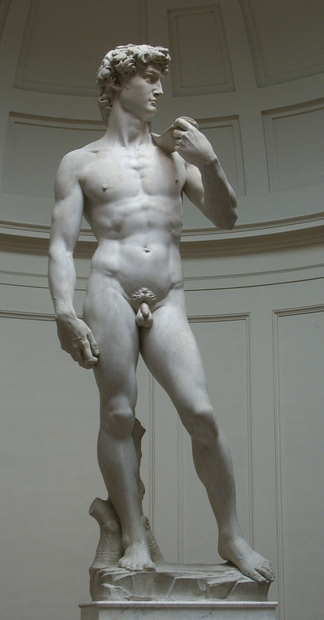
The piece of art that I want to discuss is Michelangelo sculpture of " The David " .
For the next three paragraphs I will be discussing the imitationalism, emotionalism and the formalism characteristics of the David. The purpose of the paragraphs is to extend your knowledge of the sculpture and to further you interest in art.


Imitationalism

I believe that the David especially has all the characteristics of imitationalism. The David has all the seven qualities that can make a sculpture, panting or a drawing imitational. When looking at the David you can tell it has literal quality because you can see what the artist was tyring to portrait without thinking or seeing a deeper meaning. The David also shows the precise detail and patience that Michelangelo went through while carving the David with the limited space of marble he had. Basically the way the David portraits life like qualities is what ultimately imitationalism is about, creating the illusion of life.

Emotionalism

Emotionalism is a key part of art. It should show emphasis on the mood of the piece of art and should create a similar feeling throughout the audience. When you look at the David you can not only see but feel the emotions of it such as patience strength, fear and responsibility. When the David was placed in Greece it was supposed to provide protection by warding of invaders, by knowing this you can feel the tremendous amount of responsibility that the David had to with take. That is how the David displays emotionalism.

Formalism

The elements of the David differ throughout the sculpture. By looking at the David you can tell that the texture varies from top to bottom. At the top of the David you can tell by looking at it that the hair is very heavy proportionate wise because every single line of hair is carved to show the illusion of actual hair. The way that Michelangelo decided to actually make his sculpture proportionate is by creating David's body with very smooth and curvy lines to even out the weight of his hair. In the end David is even out by the way that he is shaped.

By adding all of these elements together you can come out with a fantastic piece of art that will initially impress your audience. By creating the illusion of life, giving it emotion and by following the rules of formalisation you painting, drawing or sculpture will be great. Because of these three things I decided to do the David as my written project